
The pictures are a useful reminder that the sciences are not immune from making choices that will sway supporters and stakeholders.
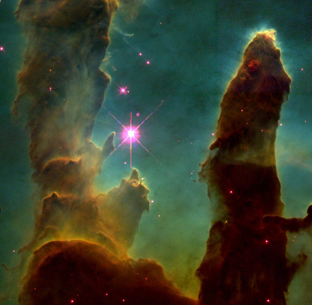
The Hubble Telescope that was launched by the Space Shuttle Discovery 25 years ago has had a remarkable run as a celestial observer. Almost everyone has seen images that have transformed what we thought was the vast blackness of space into a virtual garden of constellations and stars. The empty sky of Stanley Kubrick’s 2001: A Space Odyssey (1969) has been replaced by the color and depth of an exuberant expressionist painting.
What many may not know is that NASA and other space agencies “colorize” pictures coming from satellites and probes. They do to our solar system what Ted Turner and TNT television once tried to do to the classic black and white film, Citizen Kane.
Elizabeth Kessler notes in her book, Picturing the Cosmos,1 that NASA has a strong bias for essentially photoshopping their images with the kind of earth-tone colors we associate with the Southwest. Raw images show up first at the space center in what is functionally black and white. One astronomer Kessler cites observes that at the distances involved “true color becomes largely moot, since we can’t perceive it in the first place.”(p. 153). And so NASA loads Hubble pictures with a chromatic palette that reflects our continuing romance with images of the untamed West. The best known reference points are the famous larger-than-life Rocky Mountain and Sierra paintings done a 100 years ago by Thomas Moran and Albert Bierstadt.

As early as 1983, New York Times writer and photographer Malcolm Browne complained about what was then the fairly new practice of essentially dressing up views of our galaxy:
“Some of the lies perpetrated by astronomical pictures are unavoidable or even useful. False-color images enable scientists to discern all kinds of things that would escape notice in an ”honest” photograph. But there is a trace of deliberate mendacity having nothing to do with scientific purpose in some of those pictures. The very scientists who gave us those great Voyager planetary photographs, moreover, are among the culprits; they have candidly acknowledged that the vivid, enhanced-color pictures we saw of the Jupiter and Saturn flybys were distributed in deference to popular taste. Neon-tinted pictures very likely get better results than drab ones, when budgets come up for review.”2
To be sure, a professional rhetorician like myself should be the last person to complain about the idea of adornment. And I won’t. A basic presumption of a word-person is that we always construct the world we need using the vast treasure of colorizing language.
The lesson here is simple. The pictures are a useful reminder that the sciences are not immune from making choices that will sway supporters and stakeholders. The presumed black-and-white simplicity of sorting the “subjective” from the “objective” begins to melt into converging Jackson Pollock swirls when the processes of scientific discovery are presented in the interpretive languages of text and imagery. We may aspire to be hard-headed empiricists. But we are all necessarily transformed into advocates when we become narrators of our work to the world.
________________
1Elizabeth A. Kessler, Picturing the Cosmos: Hubble Space Telescrope Images and the Astronomical Sublime (Minneapolis: University of Minnesota Press, 2012).
2 Quoted in Anya Ventura, “Pretty Pictures:” The Use of False Color in Deep Space, InVisible Culture: An Electronic Journal for Visual Culture, October 29, 2013.
________________
Comments: Woodward@tcnj.edu