
Goudy Stout might be an even better choice for the administration.
Given all of the crises that the current administration is creating or attempting to manage, it was a puzzle to see Secretary of State Marco Rubio take the time at the end of 2025 to issue a memo calling on employees to not use the Calibri font in documents. Calibri is what typographers would call a “clean” font. It uses a “sans” style (no extraneous tails) designed to be easily read: a help for less-than-perfect eyes. Some muddled thinking from the Secretary determined that it’s continued use might be seen as a gesture to the discredited values of diversity, equity, and inclusion that we used to celebrate. Better to stay with Times New Roman, which had been the department’s official typeface until what members of the current administration must have seen as an alarming update to Calibri in 2023.
It takes an active imagination to find a “woke” political ideology at work in Calibri. And it’s a puzzle that a man in the midst of putting his thumb in the eye of former European allies would spend his time this way. According to Rubio “Calibri achieved nothing except the degradation of the department’s official correspondence.”
![]()
Really? What an interesting descent into magical thinking. Causing so onerous an effect as human degradation is a lot to put on this widely admired typeface. Luckily the nation has been spared of a decision to revert to a typeface that resembles what is on my ancient L.C. Smith typewriter, which can handle Middle English.
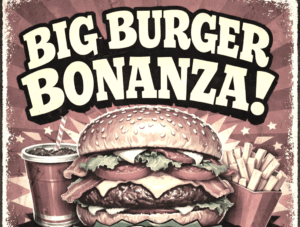 If we really want to read intention in fonts, my suggestion is to go all the way to a typeface that better mirrors the administration: something that shouts rather than merely announces. GOUDY STOUT is found in some comic books, pre-schools, and garish advertising. As its appearance suggests, it has perhaps put on a little too much weight. But it is perfect for narcissists because it doesn’t require exclamation points. It also looks homemade and manages to hog space on a page, suggesting a smirk embedded in any message for which it might be used.
Times New Roman snuffs out any hint of adapting to readers who struggle to read small print: all the better to shoot down any gestures that could be understood as inclusive. In addition, if there’s news from the State Department that it wishes to play down, perhaps Times New Roman in grey and tiny eight point type would be the perfect standard.
![]()