Software such as Word, Publisher and Pages have essentially put the tools of newsrooms and their compositor desks on our computers. First published in 2018, this piece remains a favorite because it blends consideration of the visual and the textual.
Most of us never stop to consider the choices of fonts chosen by a website or publication. We know that different fonts exist. But we usually don’t consider how they might enhance or impede our abilities to improve ideas committed in print or pixels. Though it’s probably unlikely you will run into a font junkie, it’s worth noting that their unusual passion has a point. Fonts and the impressions they make are important.
 Because all of us have become—at least to some extent—“publishers” of materials passed on to others, it makes sense that software such as Word, Page and Publisher have essentially put the tools of newsroom compositor desks on our computers. My computer is set at a conservative default of Times New Roman, 12 point, originally designed in the 1930s for Britain’s London Times. It’s the kind of font you might see in a letter from a law office. The point number is indicates the size of the font. If we bold it, we are adding “weight” to it. And we can also alter the spaces between letters (called “kerning” in typography). But add too much, and it looks like you are a M-o-r-s-e C-o-d-e o-p-e-r-a-t-o-r.
Graphics experts are quick to note that there are few hard rules on choosing fonts. Nonetheless, the choices we make can be either badly out of place or situation-appropriate. For example, content for children or adolescents may feature larger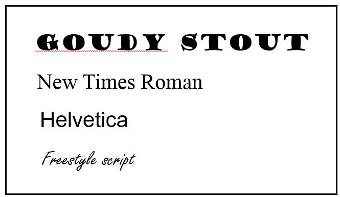 and often rounded font styles, such as Goudy Stout. It suggests an upbeat or playful approach to its subject. But it would be totally inappropriate in most business correspondence. Similarly, if you are announcing events or designing a poster, you would probably avoid “office” fonts such as New Times Roman, which look old fashioned and formal. You might consider choices that are more contemporary, like Helvetica, the default choice for a lot of advertising, and similar to the font used in this blog. Helvetica is a sans font, omitting the serifs, or longer “tails” or “projections” extending out from an individual letter. Freestyle Script is an example of a serif font. It’s commonly used in invitations and announcements. But written script generally lacks the assertive boldness of a font with more weight, like the terrific and vaguely art-deco Broadway in the “FONTS” graphic at the top right of this post.
We expect similarity and continuity in most print forms. It’s risky to choose anything that requires more work from a reader.
In business correspondence and commercial pitches it’s important to choose a font that scans easily. The eye should glide easily through lines of copy without running into jarring changes. Most sans fonts are designed to be easy on the eyes. Not so with varied Gothic fonts that can look like spider webs. It’s also advisable to avoid abrupt changes in font types, colors and point sizes. We expect similarity and continuity in most print forms. It’s risky to choose anything that requires the eye to work harder. Achieve variety by using headlines that are larger and often bolded. It also makes sense to apply fresh eyes to how the text works on the page. No spacing between lines–a function of “leading” that is too tight–can be daunting. The reverse problem–too much space–requires the eye to do more work as it returns to the next line.
Publishers vary in their sensitivities to how text sits on the page.
All of this applies to online publishing as well. Individual computer defaults can affect what we see. Even so, to see fonts well used and laid out, visit the online pages of the Washington Post. The fonts for headlines and text are consistent, simple, generous in size, and held together in consistent blocks. For a less successful use of online fonts see The New York Times. A greater variety of font styles and sizes creates a bit too much ‘visual noise.’
Publishers of books vary in their sensitivities to how text sits on the page. One of the best studies of communication I have ever read–a classic in the field–was apparently delivered as a longer manuscript than the publisher would have liked. The result was out of character for a mainstream publisher: a cheesy small font with lines seemingly on top of each other. The author’s wonderful ideas deserved to be better dressed.
![]()
![]()